CSS-3 Position

Hello there, I'm Adnan Sarkar, currently studying BSCSE at United International University. At present, I'm learning full-stack javascript.
The most commonly used CSS property is Position. We can't place the content perfectly without using the position property. For example, If you need a box a little bit up from its parent's content, If you need to fixed that content or sticky then the CSS position is the perfect thing to do that.
Different types of the Position property:
- static
- relative
- absolute
- fixed
- sticky
static position:
By default, what we are writing in HTML it's treated as a static position. So, the static position is default and there is no other property like top, bottom, left, right etc for moving the content.
relative position:
This relative position is a very commonly used position property. Basically, it's used for moving content from a current position to a specific position using top, bottom, left, right. For example:
<div>
    <h1>Hello World</h1>
    <p>Lorem ipsum dolor sit amet.</p>
</div>
And this HTML looks like the image below.
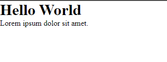
In this HTML code, there is a div tag and this div tag has 2 child tags. Now if we are giving the div tag's position relative and set his position from top : 100px then the entire div tag and his child tags will go 100px down from the main/old position.
div {
    position: relative;
    top: 100px;
}
After giving this CSS the output will look like the image below.
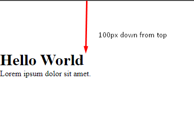
we can apply the same left, right, and bottom properties to move the current position to the specific position. The main distance will be counted if we give top then it will make distance from top to bottom, same as others.
absolute position:
This is the main position property that we are looking for. Basically, it will help us to float the specific content and give it to our desired position. But the main condition is that, it won't work without any parent and which will be relative. That means, we have to compare from parent's content to the desired content, top, bottom, left, right will count here from the parent's content position, not the current absolute content position. let's see details about it.
First, let's do some codes.
<div class="parent">
    <div class="child"></div>
</div>
There are two div tags that have parent and child classes.
.parent {
    margin: 20px auto;
    width: 200px;
    height: 200px;
    position: relative;
    background-color: #22CB5C;
}

.child {
    width: 100px;
    height: 100px;
    position: absolute;
    background-color: #EDC126;
}

After applying CSS it looks like this.
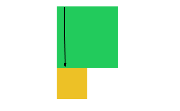
The content of position absolute starts from its immediate parent content. Now if we give this child content top:100px then this 100px will count from parent's top to bottom.
.parent {
    margin: 20px auto;
    width: 200px;
    height: 200px;
    position: relative;
    background-color: #22CB5C;
}

.child {
    width: 100px;
    height: 100px;
    position: absolute;
    background-color: #EDC126;
    top: 100px;
}
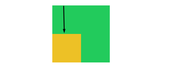
If we give it to more than the parent's content then child content will just float from the parent's content and go outside.
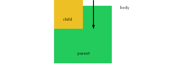
What happened if the parent div not to be relative?
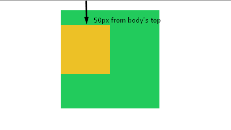
Then the parent's parent which is actually body will be treated as relative position by default, and this time child content will count from the body's top.
Now if we give it to top:50px then this 50px will count from the body's top not the parent's top.
.child {
    width: 100px;
    height: 100px;
    position: absolute;
    background-color: #EDC126;
    top: 50px;
}
All things are the same for bottom, left, right.
z-index:
We know about the x-axis, and y-axis, for 3d model there is another axis the z-axis.
this z-axis work from the content above and below. It looks like 3 books are on each other.
<div class="parent">
    <div class="child-1"></div>
    <div class="child-2"></div>
    <div class="child-3"></div>
</div>
.parent {
    margin: 20px auto;
    width: 200px;
    height: 200px;
    position: relative;
    background-color: #22CB5C;
}

.child-1{
    width: 100px;
    height: 100px;
    position: absolute;
    background-color: #EDC126;
}

.child-2{
    width: 100px;
    height: 100px;
    position: absolute;
    background-color: #35BDD0;
}

.child-3{
    width: 100px;
    height: 100px;
    position: absolute;
    background-color: #383CC1;
}
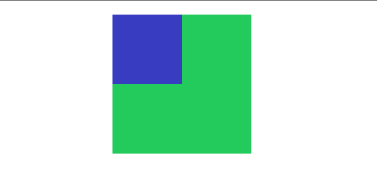
In this case, 3 child divs are absolute from the same parent, that's why they start from the same position and 3 different child divs are one above another position and the last one will top of them.
Now, If we give 3 children to the different positions from top then it will be understand very easily.
.child-1{
    width: 100px;
    height: 100px;
    position: absolute;
    background-color: #EDC126;
    top: 30px;
}

.child-2{
    width: 100px;
    height: 100px;
    position: absolute;
    background-color: #35BDD0;
    top: 60px;
    left: 60px;
}

.child-3{
    width: 100px;
    height: 100px;
    position: absolute;
    background-color: #383CC1;
    top: 90px;
    left: 120px;
}
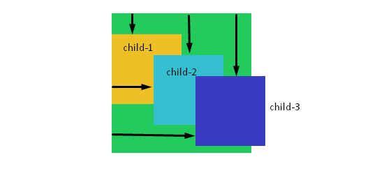
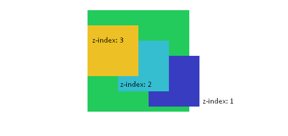
Now, z-index will play the game, if we want to anyone to the top of them then we can use z-index and the value for top to bottom is bigger value will be top, and the lowest value will be down of them.
fixed position:
This is for fixed the position permanent of any content whether the screen scrolls or not. This position is easy to understand, let's see the example below.
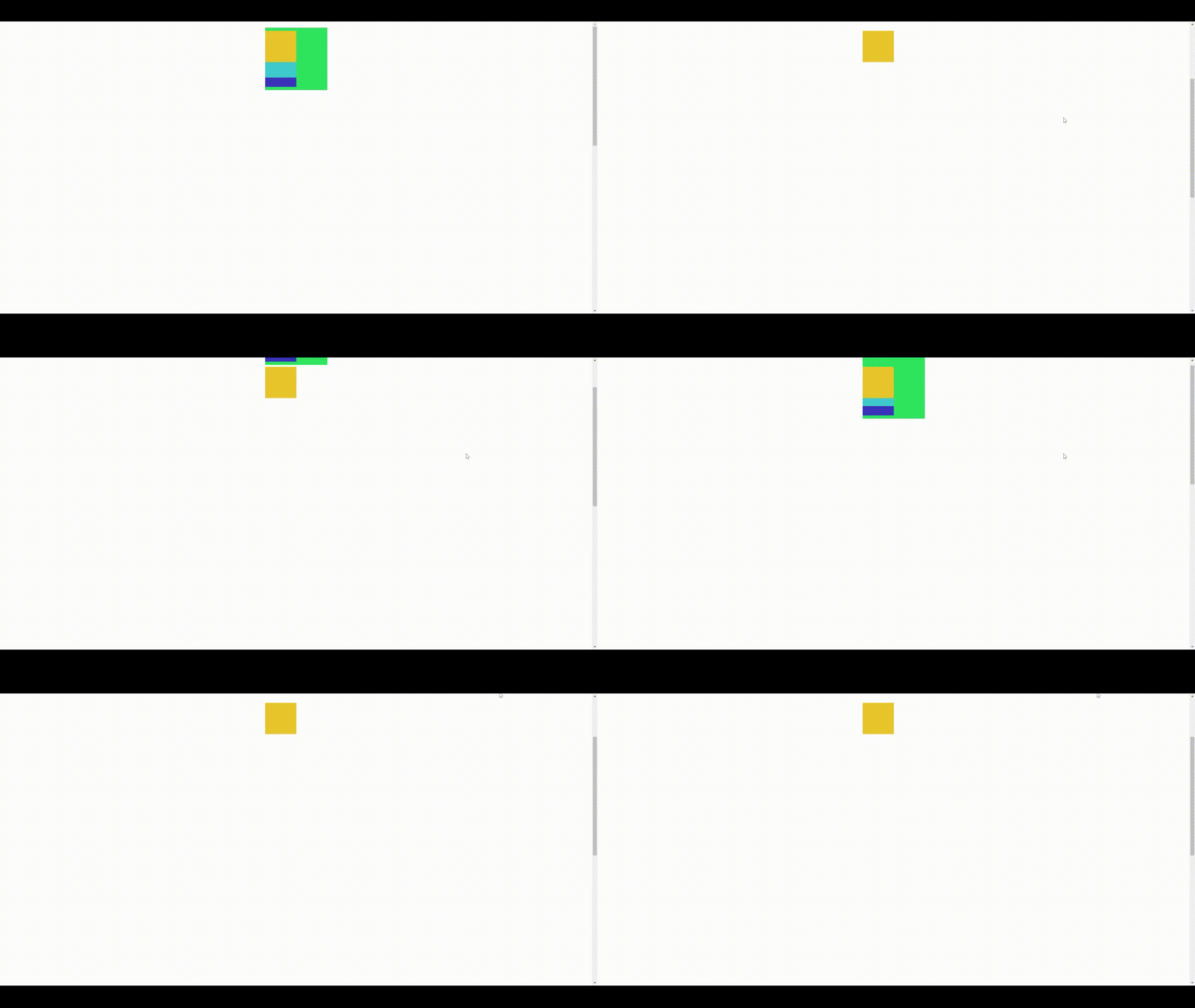
In this case, child-1 is fixed, that's the reason while scrolling the entire fixed content is visible at the same position.
sticky position:
This position is working like a relative position and fixed position combinedly. When the viewport of the screen and content is together then it works like a relative position and there is no change, but when the user scrolls the page and the content seems to be hidden for scroll down then it will work like a fixed position and content will visible while scrolling.
<div class="content-1"></div>

<div class="content-2"></div>
.content-1{
    width: 100px;
    height: 100px;
    position: sticky;
    background-color: #EDC126;
    top: 10px;
}

.content-2 {
    width: 100%;
    height: 1500px;
    background-color: #CAD5E2;
    margin-top: 50px;
}
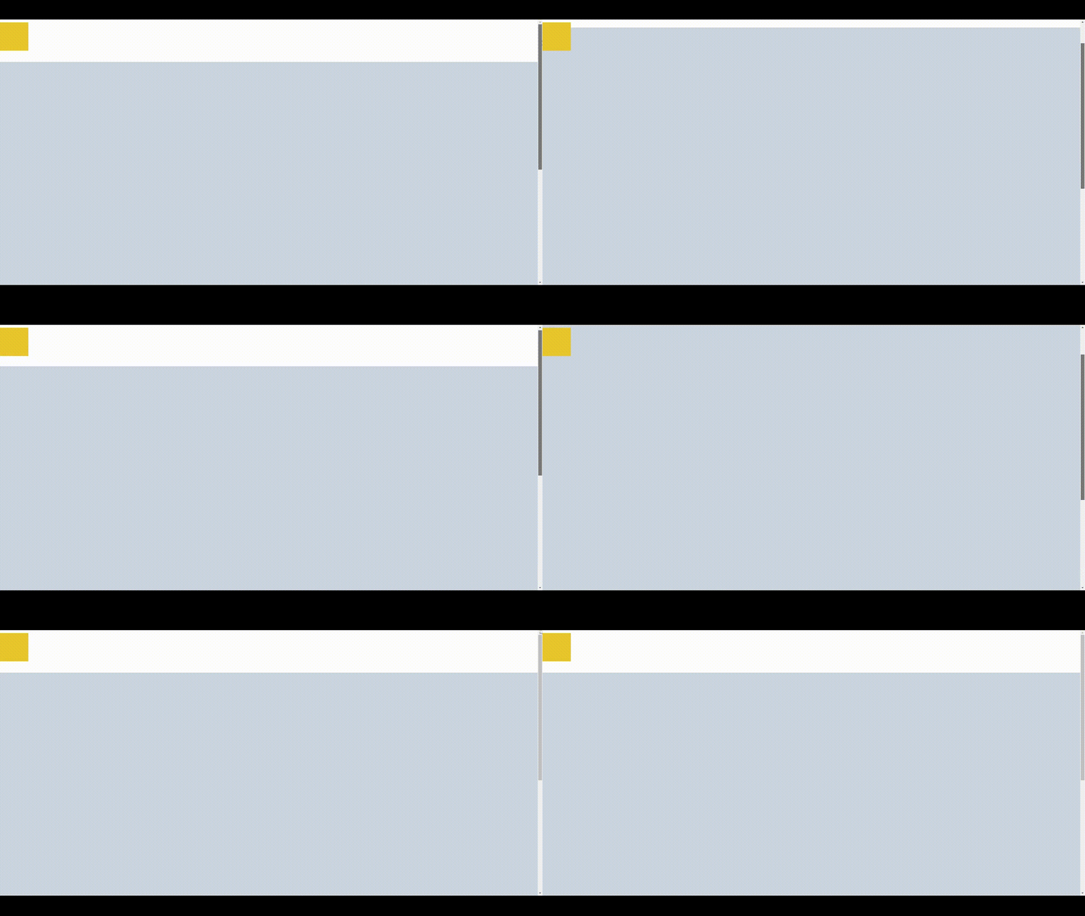
Which content do we need to be sticky, just give this content position:sticky. This will maintain the same distance from top, bottom, left, right whatever we give.
This is all about CSS-3 Position, It will be more comfortable while using more and more.